There’s more to extreme wealth than first appears. Mark Thomas points it out.
We are all used to inequality. There is inequality of height, weight, shoe size and just about every other human characteristic. And we are all used to thinking of people as being “of average height” or as “tall’ or “short”.
We expect most people to be at or close to average height and we understand that there are fewer noticeably short or tall people. That is the kind of inequality we can get our minds around.
When we graph the number of people there are in a population at any given height we generate a shape like the one in the figure Height distribution in the US. It peaks at one height – the one that is the most commonly seen – and falls away to show that smaller percentages of people are at lower or greater heights. A bell-shape like this is typical of a ‘normal distribution’.
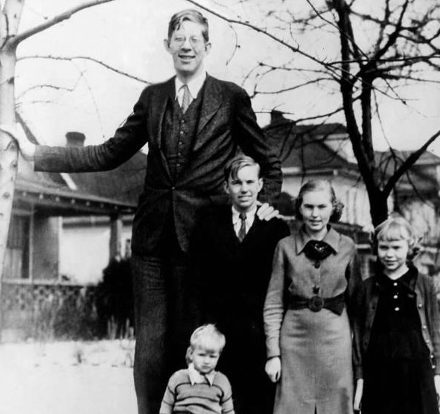
The normal distribution curve here shows that only about 4% of people are less than 163 cm tall, and only about 2% are more than 193 cm tall. The tallest man in the world was Robert Wadlow, who was 272 cm tall. That is less than double the most common height. If you repeated this analysis with shoe size, you would get the same kind of result. Nobody has feet which are a metre long.
There are three kinds of average that reflect the spread of measurements of quantities that follow a normal distribution like height, weight, shoe size and so on. The one we most commonly use is the mean – the value you get if you add the heights of everyone in the population and divide by the number of people – which is 178cm in the height graph. Statisticians call this the (arithmetic) mean – the other two are:
- the mode – the most frequent value – in the height graph this is 178 cm; and
- the median – the height exactly in the middle of the distribution – which is 176.5cm.

So, all three kinds of average are very close to each other. That is the kind of distribution we (and statisticians) are used to. And it is the kind we can get our minds around.
But wealth is different. The distribution of wealth is so strange that it is hard to comprehend. And it is so extreme that it distorts the functioning of our democracy.
In the graph Household wealth in the UK we see data on wealth inequality in the UK, presented as a frequency distribution – not including the wealthiest 10%, who are off the scale.
Household wealth in the UK: no room to fit the nation’s richest people on this graph.

In wealth distribution, the three kinds of average are dramatically different:
- the mode is between zero and £50,000;
- the median is around £300,000; and
- the mean is around £560,000.
Here, unlike with heights, each average tells a completely different story.
The mode tells us that it is far more common to have household wealth in the band £0-£50,000 than any other band of the same spread. The median tells us that a household in the middle of the distribution has total wealth of about £300,000 – six times more than the mode. And the mean tells us that there is so much wealth in the top part of the distribution that if it were equally divided between every household, each one would have almost double what the median household has. So this can be quite baffling.
To help us get our minds around this kind of inequality, two metaphorical tales are very helpful.
Pen’s Parade and Taleb’s stadium are two metaphors for the disparity of wealth in the world. The first is due to the Dutch economist, Jan Pen; the second, to writer and statistician Nassim Nicholas Taleb. I have adapted them both to relate to UK data.
Pen’s parade
Jan Pen created an image which shows graphically how much richer the wealthiest are than everyone else.
Imagine a world in which everyone’s height is proportional to their wealth and where the median height is 178 cm. Next imagine lining up a population of this world’s equivalent of the UK in order of wealth: poorest first, richest last. Now imagine this line of people parading past you at a rate of about 200,000 people a minute. The entire population of the other world’s UK would march past you in about five hours. And this is what you would see.
For the first three minutes, you would see some extraordinary creatures who have a negative height. They would be followed by tiny folk, less than 30 cm high who would take up the rest of the first quarter of an hour. Gradually the height would rise as the richer folk pass, until, after a little over 2.5 hours, what we think of as normal people, at 178 cm tall, would stride past.
But then the height of people in the passing parade would continue to increase: after three hours, you would be seeing wealthy people 230 cm tall; after four hours, they would be 456 cm tall; and after five hours, the people would be around 12m tall. You would have to crane your neck to look at their faces.
And in the last three minutes, the people would average over 50m in height. And the last 171 people – the counterparts to the UK’s billionaires – would all be over 6km high. Finally, bringing up the rear of these gigantic creatures, would come the Jim Ratcliffe of Pen’s world. Chemicals billionaire, Jim Ratcliffe was until recently, the UK’s richest man, and his counterpart in Pen’s world would be over 150km tall – 17 times taller than Mount Everest.
But even he would appear insignificant next to that world’s Elon Musk at 1,542km and its Jeff Bezos at 1,149km.
Taleb’s stadium
Normal people and even professional policymakers find it hard to get their minds around how extreme wealth inequality is, so they often ignore the top of the distribution as being outliers. Taleb’s stadium shows how wrong that is.
Wembley Stadium has a capacity of 90,000 people. Were it filled with a random selection of the UK’s population, their average height would be 178 cm and their mean household wealth would be around £560,000.
If Robert Wadlow walked into the stadium, the mean height would rise by much less than a millimetre. The change would be undetectable. But were Jim Ratcliffe to enter the stadium, the mean wealth would rise by over £270,000 – an increase of 50%.
We are used to dealing with distributions in which it makes sense to ignore the outliers because, as with Robert Wadlow walking into the stadium, their impact is so small that we can safely ignore them. But when it comes to wealth inequality, the disparities are so great that we cannot ignore them – and with the wealthiest people we cannot ignore even one of them.
Once we have absorbed the extent of financial inequality we live with, it’s natural to ask: how much is financial inequality simply a reflection of hard work and intelligence?
Well, let’s look at a few normally-distributed things that affect our abilities and work rate in the UK:
- the average IQ is 100, and no one has an IQ of 300;
- the average working week is 40 hours, and no one works 160 hours; and
- the average number of years worked is 40 and no one works for 100 years.
So on the basis of a reward for effort and intelligence, we might expect the wealthiest to be about 30 times richer than the average. In the UK, the ratio is around 80,000. And were Jim Radcliffe’s wealth simply proportionate to his intelligence and hard work, it would not be more than £9m.
(In fact, if everyone’s wealth were a proportionate reflection of intelligence and hard work, wealth would be far more evenly distributed than it is today, and the median wealth would be nearly twice as high. So the wealthiest would be able to accrue up to about £18m).
In detail, finances are difficult to understand, but at the highest level, they are simple. There are just two key factors:
- the flow of income (from work or other sources) and expenditure (other than on capital investment such as your house); and
- your wealth such as cash in the bank, equity in your house, or shares.
The importance of the first point is clear – for most of us, our pay needs to cover our bills. For people without a large stock of wealth, their income is essentially the whole story.
But wealth is a buffer and can change the game – for some people.
Half of all households in the UK have less than £300,000 in total wealth – and most of that is tied up in the house they live in and in pension schemes, so it is not money they can use for normal spending. So for most people, if you spend more than you earn, you are in trouble.
But the top 1% have, in addition to their property and pension wealth, more than £1m in financial wealth invested in, for example, stocks and shares. They can spend that more or less as and when they wish.
And if you have even more financial wealth (say) £5m, the story changes completely. You might expect an annual return of 6% in an average year: that is £300,000. Of that 6%, 2% might be due to inflation, but that still leaves £200,000 you could spend in the year without reducing the real (inflation-adjusted) value of your wealth. Your earned income could be zero and you would still be very comfortable.
The wealth data are drawn from the Office for National Statistics in the UK and Federal Reserve Economic Data in the US.
If the UK seems extreme, the US is even worse (see graph Wealth distribution US vs UK).

The poorer half of the US population own only around 3% of the total wealth, whereas the richest 1% own over 30%.
Looking globally, the pattern is generally that Europe has lower wealth inequality than US and UK – but many other countries are even more extreme.
Does this really matter? A few individuals are extremely wealthy, certainly – but what does that have to do with the rest of us?
While it might seem reasonable, from a policy perspective, to ignore the super-rich as unrepresentative outliers, excessive wealth concentration undermines democracy.
Making very large amounts of money is about playing a game: the game of capitalism. Like any game it demands skill and effort to play it well. But unlike most other games, ability to play the game of capitalism is also heavily determined by the social circles you move in and by the amount of money you have available as you start the game. It is also strongly influenced by whether or not you are in a position to rewrite the rules of the game in your own favour.
Making money from business investments requires:
- that you are aware of an investment opportunity and have access to the individuals who control it;
- that you have capital to invest; and
- that you either have the skill to manage the investment yourself or can buy these skills in.
Starting with a large amount of capital is a big advantage in playing this game. It helps you with all three requirements. The game is rigged against those without this advantage.
Even more worryingly, there are four key levers of power that are easier to pull if you are extremely rich:
- access to elite education;
- access to social circles of the rich and powerful;
- access to policymakers and politicians; and
- ownership of major media outlets.
Mixing in the social circles of the rich and powerful gives access to politicians and policymakers and enables one – especially if the player is also a major political donor – to have a direct influence on policy drafting as well as on the way that legislators will vote on draft bills that are presented to the house.
With extreme wealth comes the option to own major media outlets, which strengthens access to politicians and policymakers and also gives the owner control of the dominant narrative in society and therefore the ability to influence the votes of millions. The media empire of Rupert Murdoch, has never been shy of trying to influence political outcomes. On Saturday 11 April 1992, The Sun famously claimed to have determined the result of the then recent general election in the UK.

More recently, the acquisition of Twitter by Elon Musk, has given him the power to set its editorial (moderation) policy to reflect his own beliefs – which are market fundamentalist in nature.
All this enables the wealthiest individuals to shape policy in the interests of their own businesses, for example by encouraging the government to sell public assets at below intrinsic value, by creating tax breaks and perpetuating loopholes and by reducing regulation. It allows them to undermine democracy. And they do.
The 99% Organisation is calling for five key actions to preserve our democracy and prevent the impoverishment of the UK population. In brief, these are:
- A democratic reset to protect the integrity of our democracy and ensure that government policy is set for the benefit of the whole population, not just for its donors;
- Fact-based policy – the dominant policy of the last 12 years has been austerity, based on the myth that the ratio of UK debt to GDP is at historically high levels;
- Policy for solidarity and abundance – recent policy has neither grown the pie nor shared it fairly;
- Wise investment in the future – recent policy has unwisely underinvested in key areas like health and infrastructure;
- Cleaning-up capitalism – ensuring that the playing field is levelled so that unethical businesses cannot out-compete ethical ones by externalising their costs to society (for example by paying less than a living wage, so that their wage bill is subsidised by the taxpayer).
If this matters to you, please do sign up and join the 99% Organisation.

Bravo Mark
Brilliant analysis extremely well presented!! Thank you for shedding light on this in a very helpful way!!
Best wishes
Chris